letter-spacingプロパティ
letter-spacingプロパティは、文字の間隔を指定するプロパティです。
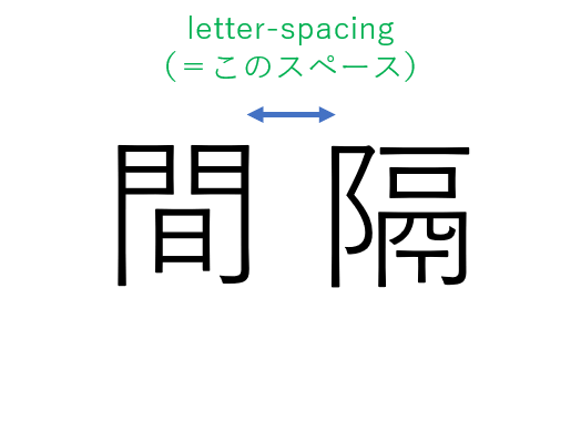
letter-spacingを指定する方法は2つあります。
pxでの指定
例えば、以下のように書きます。
htdocs/HTML/index.html
<!DOCTYPE html>
<html>
    <lang="ja">
    <head>
        <meta charset="UTF-8">
        <link rel="stylesheet" href="style.css">
        <title>CSSの基礎</title>
    </head>
    <body>
        <div>これは要素です</div>
    </body>
</html>
htdocs/HTML/style.css
div {
    letter-spacing: 20px;
}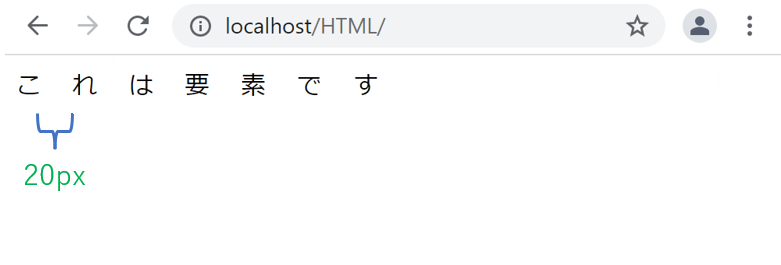
pxで指定すると、指定した値がそのまま文字の間隔になります。
emでの指定(推奨)
emで指定すると、font-sizeに応じて文字の間隔を変えてくれます。「1em = 文字の高さ」となります。「letter-spacing: 0.1em;」と指定すると、文字の高さの1/10倍の間隔に、「letter-spacing: 0.5em;」と指定すると、文字の高さの1/2倍の間隔にすることができます。
htdocs/HTML/index.html
<!DOCTYPE html>
<html>
    <lang="ja">
    <head>
        <meta charset="UTF-8">
        <link rel="stylesheet" href="style.css">
        <title>CSSの基礎</title>
    </head>
    <body>
        <div class="elem1">文字の間隔を1emで指定します<br><br></div>
        <div class="elem2">文字の間隔を0.5emで指定します<br><br></div>
        <div class="elem3">文字の間隔を0.1emで指定します<br><br></div>
    </body>
</html>
htdocs/HTML/style.css
.elem1 {
    letter-spacing: 1em;
}

.elem2 {
    letter-spacing: 0.5em;
}

.elem3 {
    letter-spacing: 0.1em;
}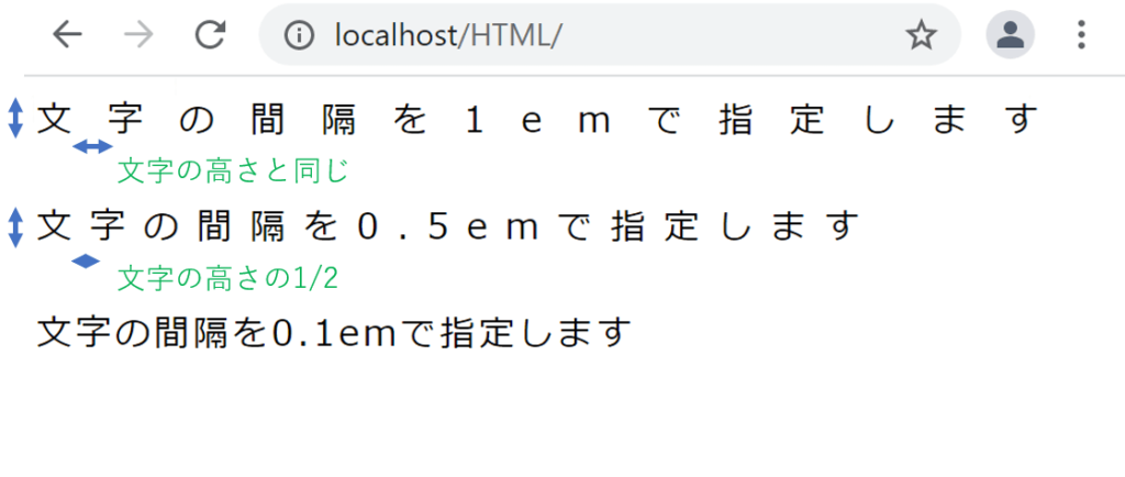
pxで指定するよりも、emで指定するほうが相対的に間隔を指定することができるためおすすめです。
また、0より小さい値を指定することで、デフォルトよりもさらに文字と文字の間隔を狭くすることが可能です。 例えば、「letter-spacing: -0.1em;」と指定すると、文字の間隔が何も指定しないときに比べて狭くなります。
positionプロパティ
positionプロパティは、要素を基準となる位置からどこに配置するかを指定するプロパティです。
positionを指定する方法は複数あります。順にみていきます。
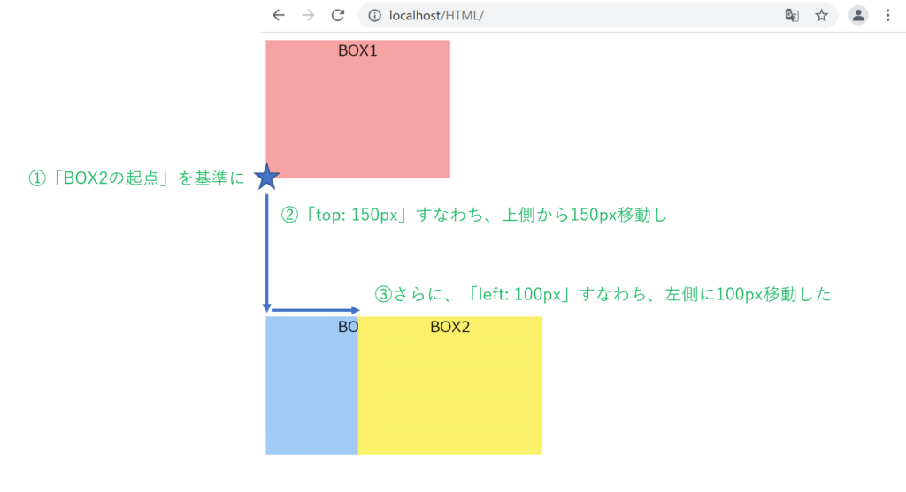
relativeでの指定
relativeは現在の位置を基準に、相対的な位置を指定します。
まず、以下のように書きます。
htdocs/HTML/index.html
<!DOCTYPE html>
<html>
    <lang="ja">
    <head>
        <meta charset="UTF-8">
        <link rel="stylesheet" href="style.css">
        <title>CSSの基礎</title>
    </head>
    <body>
        <div class="box1">BOX1</div>
        <div class="box2">BOX2</div>
        <div class="box3">BOX3</div>
    </body>
</html>
htdocs/HTML/style.css
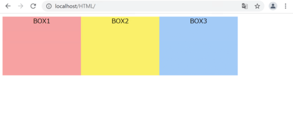
.box1{
    width: 200px;
    height: 150px;
    background: rgb(247, 162, 162);
    text-align: center;
}

.box2{
    width: 200px;
    height: 150px;
    background: rgb(250, 240, 106);
    text-align: center;
}

.box3{
    width: 200px;
    height: 150px;
    background: rgb(162, 202, 247);
    text-align: center;
}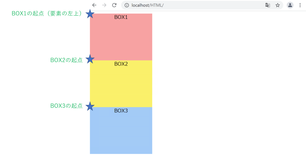
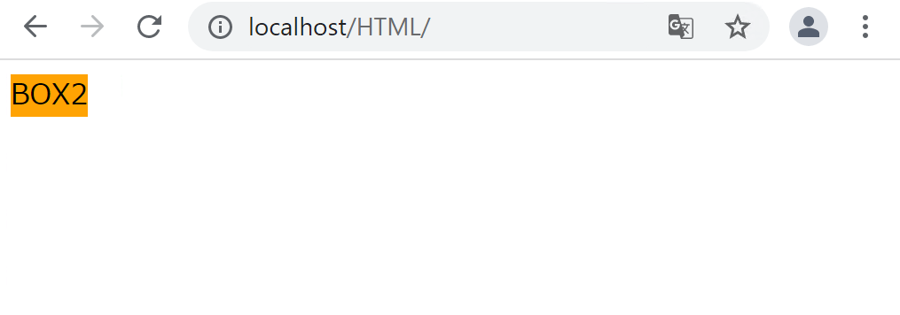
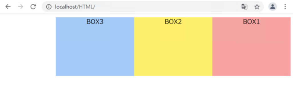
「box2」のCSSに以下のコードを追加します。
htdocs/HTML/style.css
.box2{
    width: 200px;
    height: 150px;
    background: rgb(250, 240, 106);
    text-align: center;

    position: relative; /* 追加 */
    top: 150px; /* 追加 */
    left: 100px; /* 追加 */
}
absoluteでの指定
absoluteは親要素を基準に、絶対的な位置を指定します。
まず、以下のように書きます。
htdocs/HTML/index.html
<!DOCTYPE html>
<html>
<lang="ja">
<head>
<meta charset="UTF-8">
<link rel="stylesheet" href="style.css">
<title>CSSの基礎</title>
</head>
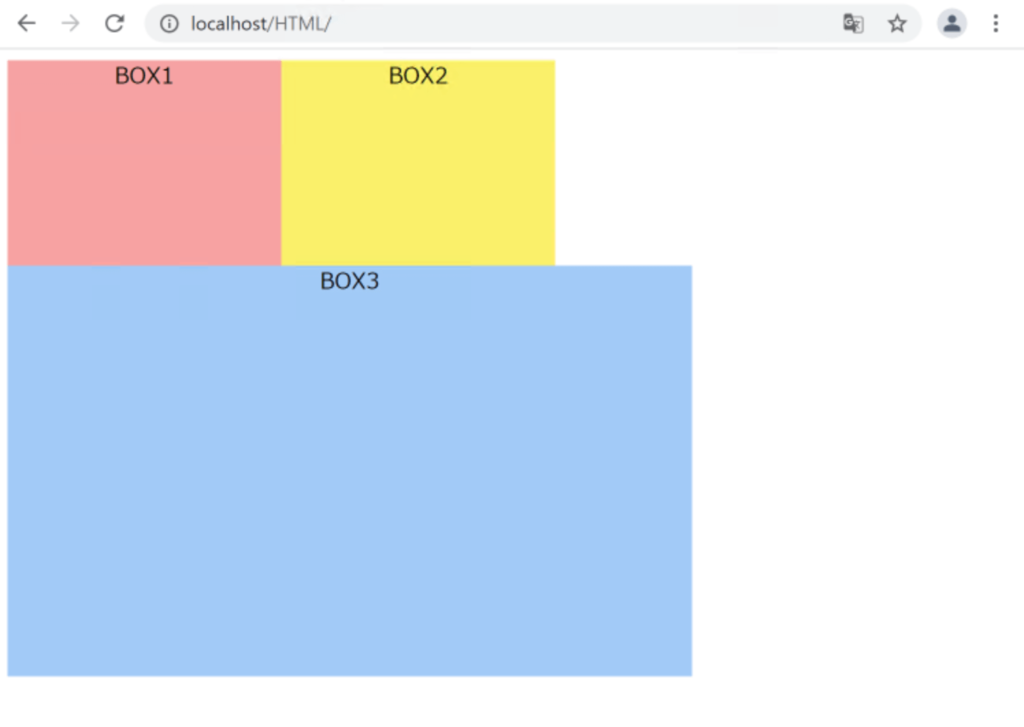
<body> <!-- ★各BOXの親要素はbody -->
<div class="box1">BOX1</div>
<div class="box2">BOX2</div>
<div class="box3">BOX3</div>
</body>
</html>htdocs/HTML/style.css
.box1{
    width: 200px;
    height: 150px;
    background: rgb(247, 162, 162);
    text-align: center;
}

.box2{
    width: 200px;
    height: 150px;
    background: rgb(250, 240, 106);
    text-align: center;
}

.box3{
    width: 200px;
    height: 150px;
    background: rgb(162, 202, 247);
    text-align: center;
}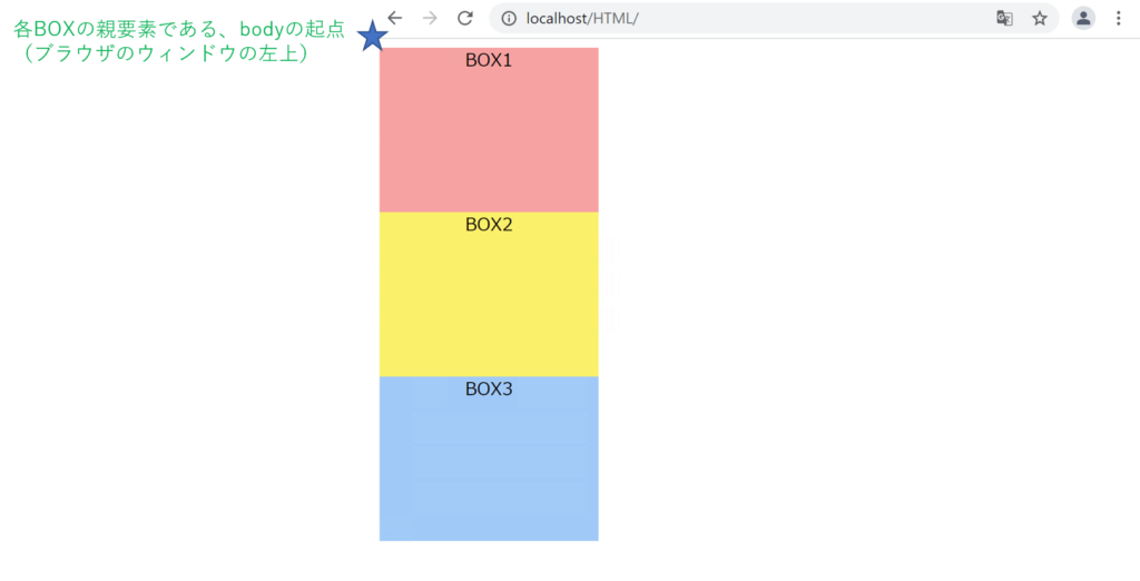
「box2」のCSSに以下のコードを追加します。
htdocs/HTML/style.css
.box2{
    width: 200px;
    height: 150px;
    background: rgb(250, 240, 106);
    text-align: center;

    position: absolute; /* 追加 */
    top: 100px; /* 追加 */
    left: 100px; /* 追加 */
}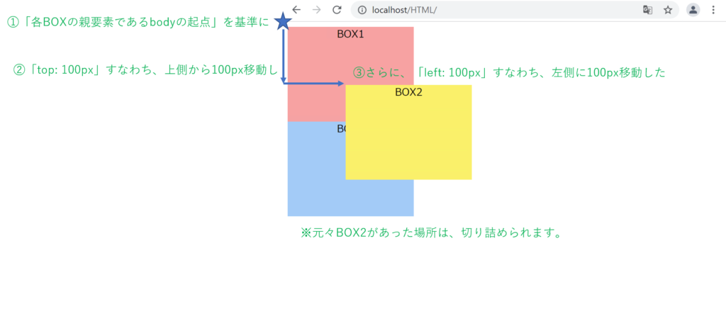
absoluteは絶対的な位置指定です。
そのため他の要素があっても、表示位置は変わらず重なって表示されます。
fixedでの指定
fixedは画面の決まった位置に固定させたいときに使用します。
例えば、スクロールしても位置が変わらないメニューバーを表示したいときなどによく使われるものになります。
例えば、以下のように書きます。
htdocs/HTML/index.html
<!DOCTYPE html>
<html>
    <lang="ja">
    <head>
        <meta charset="UTF-8">
        <link rel="stylesheet" href="style.css">
        <title>CSSの基礎</title>
    </head>
    <body>
        <p>サンプルサンプルサンプル1</p>
        <p>サンプルサンプルサンプル2</p>
        <p>サンプルサンプルサンプル3</p>
        <p>サンプルサンプルサンプル4</p>
        <p>サンプルサンプルサンプル5</p>
        <p>サンプルサンプルサンプル6</p>
        <p>サンプルサンプルサンプル7</p>
        <p>サンプルサンプルサンプル8</p>
        <p>サンプルサンプルサンプル9</p>
        <p>サンプルサンプルサンプル10</p>
        <p>サンプルサンプルサンプル11</p>
        <p>サンプルサンプルサンプル12</p>
        <p>サンプルサンプルサンプル13</p>
        <p>サンプルサンプルサンプル14</p>
        <p>サンプルサンプルサンプル15</p>
        <p>サンプルサンプルサンプル16</p>
        <p>サンプルサンプルサンプル17</p>
        <p>サンプルサンプルサンプル18</p>
        <p>サンプルサンプルサンプル19</p>
        <p>サンプルサンプルサンプル20</p>
        <p class="fixed">固定されたP要素</p>
    </body>
</html>
htdocs/HTML/style.css
.fixed {
    position: fixed;
    padding: 15px;
    top: 0;
    left: 0;
    margin: 0;
    width: 100%;
    background: pink;
    color: #000;
}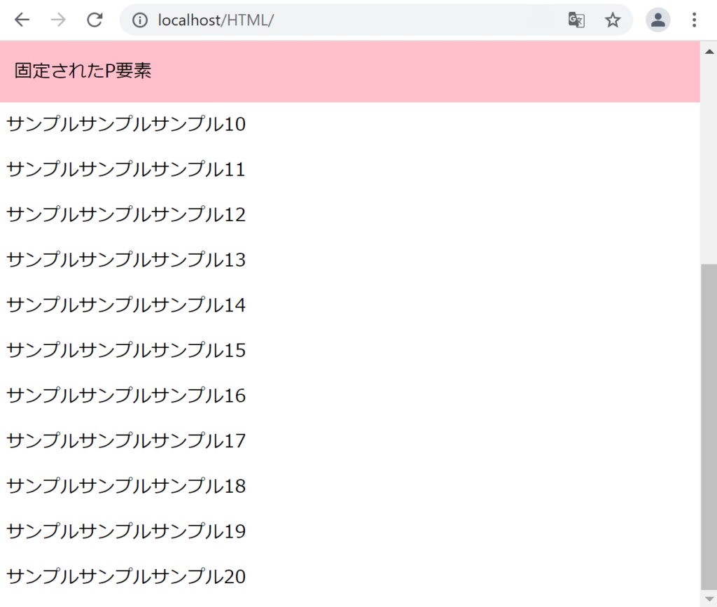
スクロールしても、「固定されたP要素」の位置は変わらないことがわかります。
displayプロパティ
HTMLを学習した際に、ブロックレベル要素とインライン要素が出てきました。ブロックレベル要素の特徴は縦に並ぶことで、インライン要素の特徴は横に並ぶことでしたね。
displayプロパティを使うと、これらのHTML要素の表示形式を自由に決めることができます。
displayを指定する方法は複数あります。順にみていきます。
blockでの指定
指定した要素を、ブロックレベル要素として扱います。
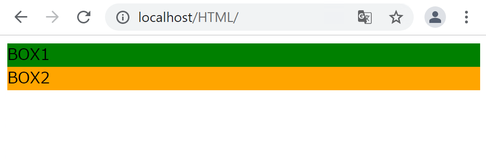
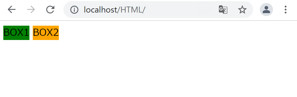
例えば、spanタグはインライン要素ですので、本来は以下のように横に並びます。
htdocs/HTML/index.html
<!DOCTYPE html>
<html>
    <lang="ja">
    <head>
        <meta charset="UTF-8">
        <link rel="stylesheet" href="style.css">
        <title>CSSの基礎</title>
    </head>
    <body>
        <span class="box1">BOX1</span>
        <span class="box2">BOX2</span>
    </body>
</html>
htdocs/HTML/style.css
.box1 {
    background-color: green;
}

.box2 {
    background-color: orange;

}
CSSに以下のコードを追加します。
htdocs/HTML/style.css
.box1 {
    background-color: green;
    display: block;
}

.box2 {
    background-color: orange;
    display: block;
}
spanタグがブロックレベル要素として扱われるようになり、縦に並ぶようになりました。
inlineでの指定
指定した要素を、インライン要素として扱います。
例えば、divタグはブロックレベル要素ですので、本来は以下のように縦に並びます。
htdocs/HTML/index.html
<!DOCTYPE html>
<html>
    <lang="ja">
    <head>
        <meta charset="UTF-8">
        <link rel="stylesheet" href="style.css">
        <title>CSSの基礎</title>
    </head>
    <body>
        <span class="box1">BOX1</span>
        <span class="box2">BOX2</span>
    </body>
</html>
htdocs/HTML/style.css
.box1 {
    background-color: green;

}

.box2 {
    background-color: orange;

}
CSSに以下のコードを追加します。
htdocs/HTML/style.css
.box1 {
    background-color: green;
    display: inline;
}

.box2 {
    background-color: orange;
    display: inline;
}
divタグがインライン要素として扱われるようになり、横に並ぶようになりました。
inline-blockでの指定
inline-blockはインラインとブロックの中間、2つの特徴を併せ持つ要素です。
インライン要素の特徴は横に並ぶことでしたが、横幅と高さについては、要素の値と同じ大きさになるというルールがあるため、widthやheightを使って横幅と高さを任意に変更することはできません。
htdocs/HTML/index.html
<!DOCTYPE html>
<html>
    <lang="ja">
    <head>
        <meta charset="UTF-8">
        <link rel="stylesheet" href="style.css">
        <title>CSSの基礎</title>
    </head>
    <body>
        <span class="box1">BOX1</span>
        <span class="box2">BOX2</span>
    </body>
</html>
htdocs/HTML/style.css
.box1 {
    background-color: green;
    width: 200px;   /* 無視されます */
    height: 200px;   /* 無視されます */
}

.box2 {
    background-color: orange;
    width: 200px;   /* 無視されます */
    height: 200px;   /* 無視されます */
}
CSSでwidthとheightを指定していますが、インライン要素であるspanに対しては無視されます。
CSSに以下のコードを追加します。
htdocs/HTML/style.css
.box1 {
    background-color: green;
    width: 200px;
    height: 200px;
    display: inline-block;  /* 追加 */
}

.box2 {
    background-color: orange;
    width: 200px;
    height: 200px;
    display: inline-block;  /* 追加 */
}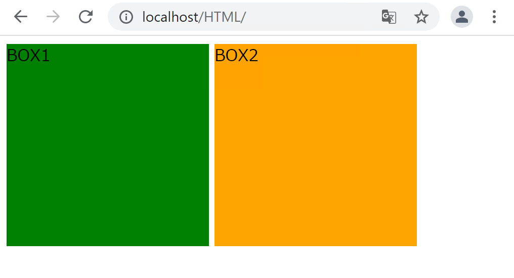
inline-blockを指定することで、横幅と高さの指定が効くようになりました。
noneでの指定
noneは指定された要素を非表示にすることができます。
htdocs/HTML/index.html
<!DOCTYPE html>
<html>
    <lang="ja">
    <head>
        <meta charset="UTF-8">
        <link rel="stylesheet" href="style.css">
        <title>CSSの基礎</title>
    </head>
    <body>
        <span class="box1">BOX1</span>
        <span class="box2">BOX2</span>
    </body>
</html>
htdocs/HTML/style.css
.box1 {
    background-color: green;
    width: 200px;
    height: 200px;
    display: none;
}

.box2 {
    background-color: orange;
    width: 200px;
    height: 200px;
}
「display: none;」を指定しているBOX1は非表示になりました。
flexでの指定
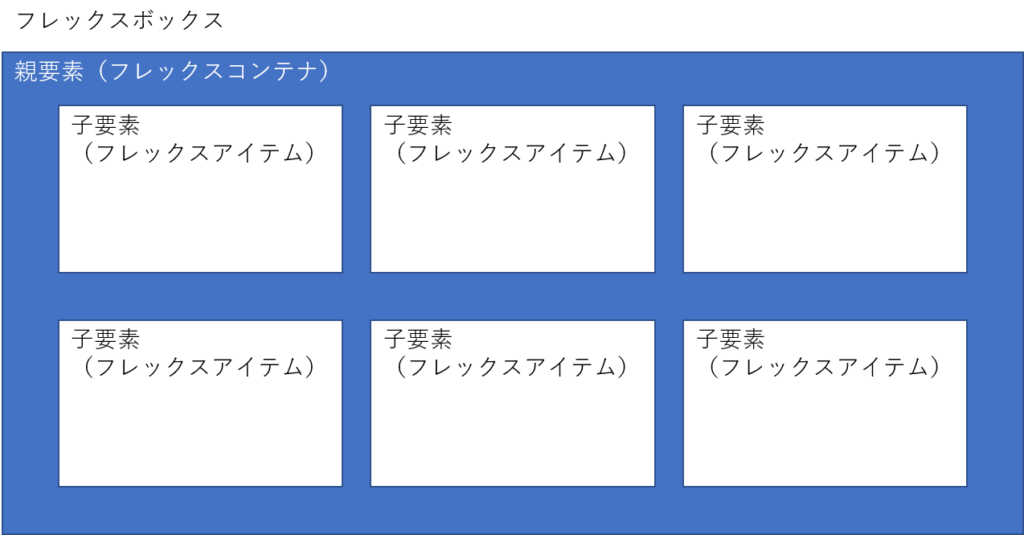
親要素に対して「display: flex;」と指定すると、 指定された親要素は「フレックスコンテナ」と呼ばれ、 その中の子要素は「フレックスアイテム」と呼ばれるようになります。フレックスアイテムはinline-blockの性質をもっており、横並びにすることができ、横幅と高さを指定することができます。
また、フレックスコンテナの中にフレックスアイテムが存在している構成のことを「フレックスボックス」と呼びます。
以下がコードの例です。
htdocs/HTML/index.html
<!DOCTYPE html>
<html>
<lang="ja">
<head>
<meta charset="UTF-8">
<link rel="stylesheet" href="style.css">
<title>CSSの基礎</title>
</head>
<body>
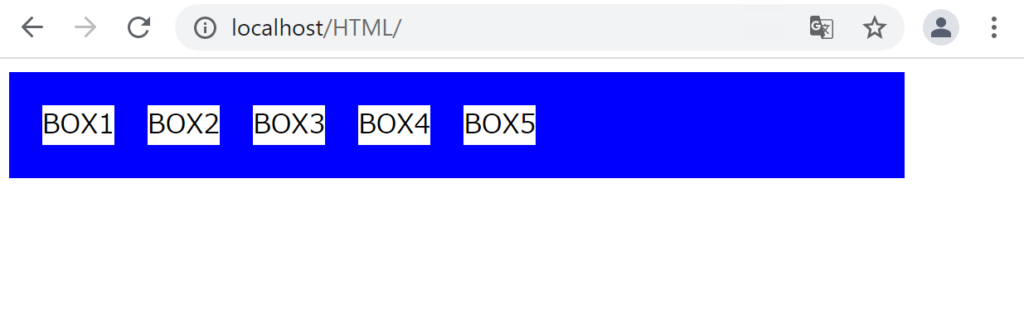
<div class="parent">
<div class="child">BOX1</div>
<div class="child">BOX2</div>
<div class="child">BOX3</div>
<div class="child">BOX4</div>
<div class="child">BOX5</div>
</div>
</body>
</html>htdocs/HTML/style.css
.parent {
    display: flex;
    background-color: blue;
    width: 500px;
    padding: 20px;
}

.child {
    background-color: white;
    margin-right: 20px;
}
list-styleプロパティ
list-styleプロパティは、リスト項目を作りたい時に、リストの要素の先頭 に○、□などの記号や数字、画像などを表示させるプロパティです。
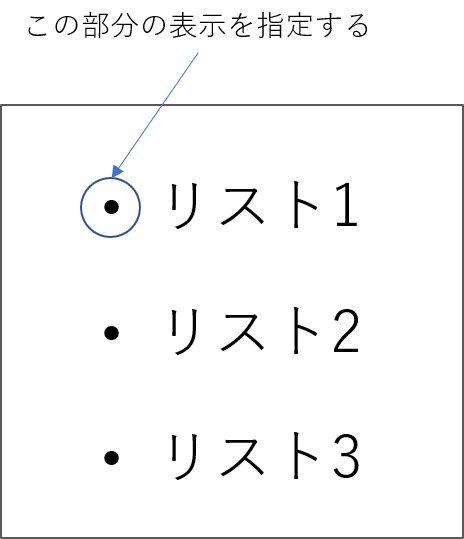
●(くろまる)の部分がリストの先頭であり、「マーカー」と呼ばれます。
list-styleの書き方には2種類あります。順にみていきます。
list-style-typeでの指定
list-style-typeを指定すると、マーカーに記号や数字を表示することができます。
例えば、以下のように書きます。
htdocs/HTML/index.html
<!DOCTYPE html>
<html>
    <lang="ja">
    <head>
        <meta charset="UTF-8">
        <link rel="stylesheet" href="style.css">
        <title>CSSの基礎</title>
    </head>
    <body>
        <ul class="list">
            <li>リストです</li>
            <li>リストです</li>
            <li>リストです</li>
        </ul>
    </body>
</html>
htdocs/HTML/style.css
.list {
    list-style-type: disc;
}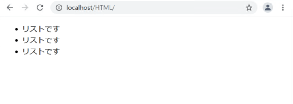
list-style-typeプロパティに「disc」を指定すると、リストのマーカーは黒丸(●)になります。これを「circle」にすると、白丸(〇)になります。他にもいろいろな種類があるので、こちらのWebサイトなどを参考に、試してみて下さい。
list-style-imageでの指定
list-style-imageを指定すると、マーカーを画像で表示することができます。
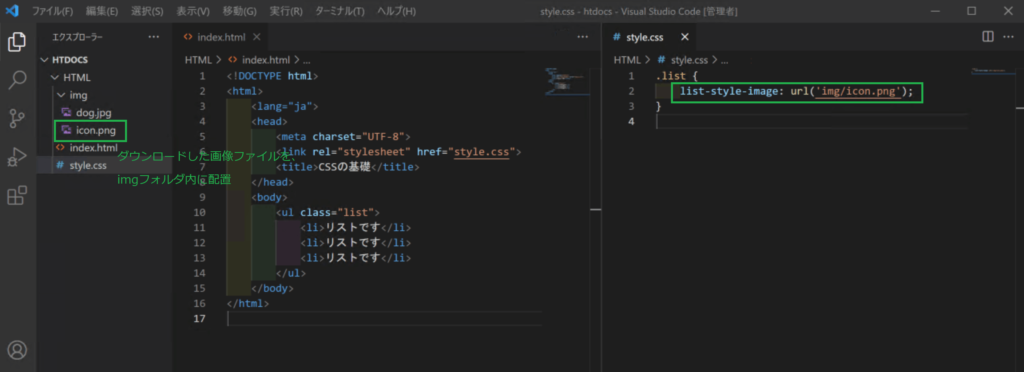
例えば、以下のような画像を使います。
この画像を右クリックして「名前を付けて画像を保存」します。
その上で、以下のように書きます。
htdocs/HTML/style.css
.list {
    list-style-image: url('img/icon.png');
}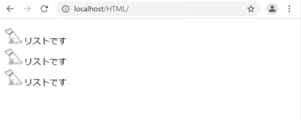
マーカーとして、画像が表示されるようになりました。
overflowプロパティ
overflowプロパティは、ブロックレベル要素からはみ出た部分の文字や画像をどう扱うかを指定するプロパティです。
例えば、以下のように書きます。
htdocs/HTML/index.html
<!DOCTYPE html>
<html>
    <lang="ja">
    <head>
        <meta charset="UTF-8">
        <link rel="stylesheet" href="style.css">
        <title>CSSの基礎</title>
    </head>
    <body>
        <p class="elem">あいうえおかきくけこさしすせそ</p>
    </body>
</html>
htdocs/HTML/style.css
.elem {
    background-color: green;
    width: 100px;
    height: 50px;
    overflow: visible;
}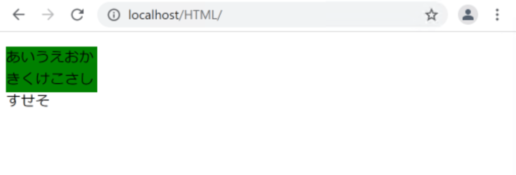
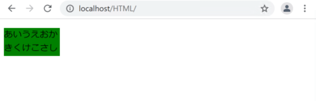
ブロックから値がはみ出していますが、値が最後まで表示されていることがわかります。
CSSを以下のように書き換えます。
htdocs/HTML/style.css
.elem {
    background-color: green;
    width: 100px;
    height: 50px;
    overflow: hidden;
}
はみ出していた値が非表示になりました。
CSSを以下のように書き換えます。
htdocs/HTML/style.css
.elem {
    background-color: green;
    width: 100px;
    height: 50px;
    overflow: scroll;
}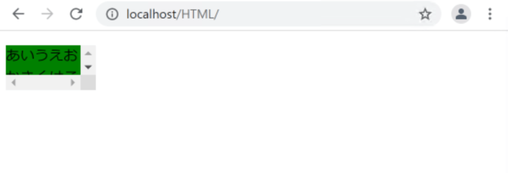
スクロールバーが表示されるようになります。
CSSを以下のように書き換えます。
htdocs/HTML/style.css
.elem {
    background-color: green;
    width: 100px;
    height: 50px;
    overflow: auto;
}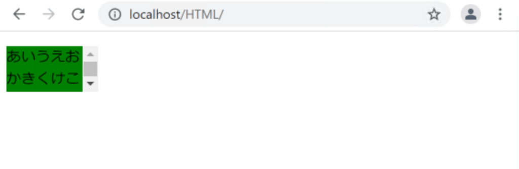
autoを指定すると、Webブラウザに処理を任せることになります。
大体の場合は、scrollと同じになります。
floatプロパティ
floatプロパティは、縦に並んでいた要素を横並びにすることができ、要素を左右のどちらかに寄せて配置することなどができます。
まずは以下のように書きます。
htdocs/HTML/index.html
<!DOCTYPE html>
<html>
    <lang="ja">
    <head>
        <meta charset="UTF-8">
        <link rel="stylesheet" href="style.css">
        <title>CSSの基礎</title>
    </head>
    <body>
        <div class="box1">BOX1</div>
        <div class="box2">BOX2</div>
        <div class="box3">BOX3</div>
    </body>
</html>
htdocs/HTML/style.css
.box1{
    width: 200px;
    height: 150px;
    background: rgb(247, 162, 162);
    text-align: center;
}

.box2{
    width: 200px;
    height: 150px;
    background: rgb(250, 240, 106);
    text-align: center;
}

.box3{
    width: 200px;
    height: 150px;
    background: rgb(162, 202, 247);
    text-align: center;
}
CSSに以下を追加します。
htdocs/HTML/style.css
.box1{
    width: 200px;
    height: 150px;
    background: rgb(247, 162, 162);
    text-align: center;
    float: left;    /* 追加 */
}

.box2{
    width: 200px;
    height: 150px;
    background: rgb(250, 240, 106);
    text-align: center;
    float: left;    /* 追加 */
}

.box3{
    width: 200px;
    height: 150px;
    background: rgb(162, 202, 247);
    text-align: center;
    float: left;    /* 追加 */
}
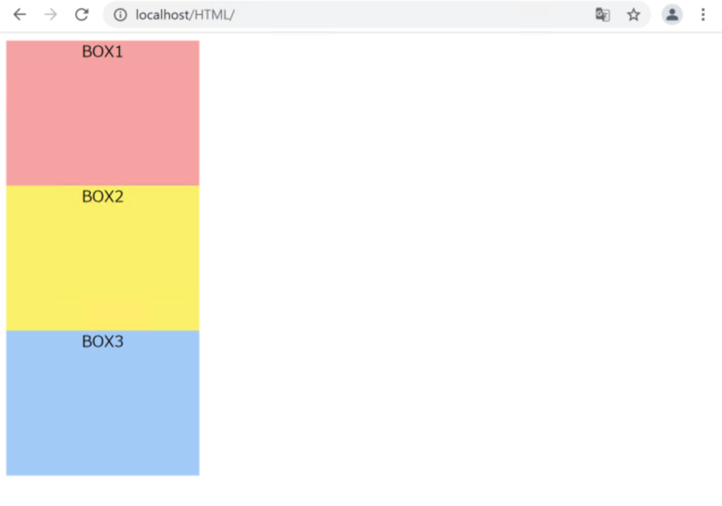
左寄せで横並びになりました。
CSSを以下のように書き換えます。
htdocs/HTML/style.css
.box1{
    width: 200px;
    height: 150px;
    background: rgb(247, 162, 162);
    text-align: center;
    float: right;    /* 変更 */
}

.box2{
    width: 200px;
    height: 150px;
    background: rgb(250, 240, 106);
    text-align: center;
    float: right;    /* 変更 */
}

.box3{
    width: 200px;
    height: 150px;
    background: rgb(162, 202, 247);
    text-align: center;
    float: right;    /* 変更 */
}
右寄せになりました。
clearプロパティ
clearプロパティは、floatプロパティととても深い関係があります。floatプロパティを使うことで左寄せや右寄せのレイアウトができましたが、floatプロパティの問題点は、その後のfloatが指定されていないHTML要素が下に回り込んでしまうことです。
実際に見てみましょう。
htdocs/HTML/index.html
<!DOCTYPE html>
<html>
    <lang="ja">
    <head>
        <meta charset="UTF-8">
        <link rel="stylesheet" href="style.css">
        <title>CSSの基礎</title>
    </head>
    <body>
        <div class="box1">BOX1</div>
        <div class="box2">BOX2</div>
        <div class="box3">BOX3</div>
    </body>
</html>
htdocs/HTML/style.css
.box1{
    width: 200px;
    height: 150px;
    background: rgb(247, 162, 162);
    text-align: center;
    float: left;
}

.box2{
    width: 200px;
    height: 150px;
    background: rgb(250, 240, 106);
    text-align: center;
    float: left;
}

.box3{
    width: 500px;
    height: 300px;
    background: rgb(162, 202, 247);
    text-align: center;

 /* floatプロパティは指定しない */
}
BOX3が下に回り込んでしまっていることがわかります。
clearプロパティは、この回り込みを「クリア(=解除する)」することができます。
CSSに以下を追加します。
htdocs/HTML/style.css
.box1{
    width: 200px;
    height: 150px;
    background: rgb(247, 162, 162);
    text-align: center;
    float: left;
}

.box2{
    width: 200px;
    height: 150px;
    background: rgb(250, 240, 106);
    text-align: center;
    float: left;
}

.box3{
    width: 500px;
    height: 300px;
    background: rgb(162, 202, 247);
    text-align: center;
    clear: left;    /* 追加 */
}
BOX3の回り込みが解除されました。
「clear: left;」の「left」は、直前の要素のfloatプロパティの値にあわせます。
直前の要素はBOX2であり、「float: left;」としているため、BOX3のclearプロパティはleftで指定しています。
本節の説明は以上になります。